
Overview
Build a web popup by arranging blocks in Notifly’s visual editor.Minimum SDK versions
To display a popup built with this editor, your site needs Notifly’s JavaScript SDK 2.12.0 or later.Personalized text requires JavaScript SDK 2.21.0 or later. Older SDK versions don’t display personalized popups. Popups without personalization still use the minimum version listed above.
Create a template
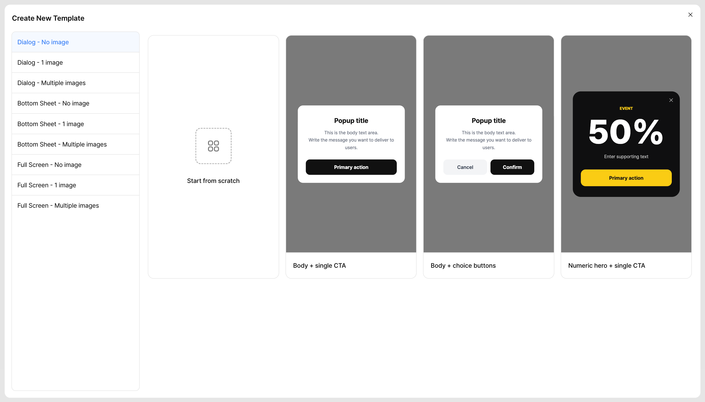
In the sidebar, go to Message Templates > Web Popup Templates.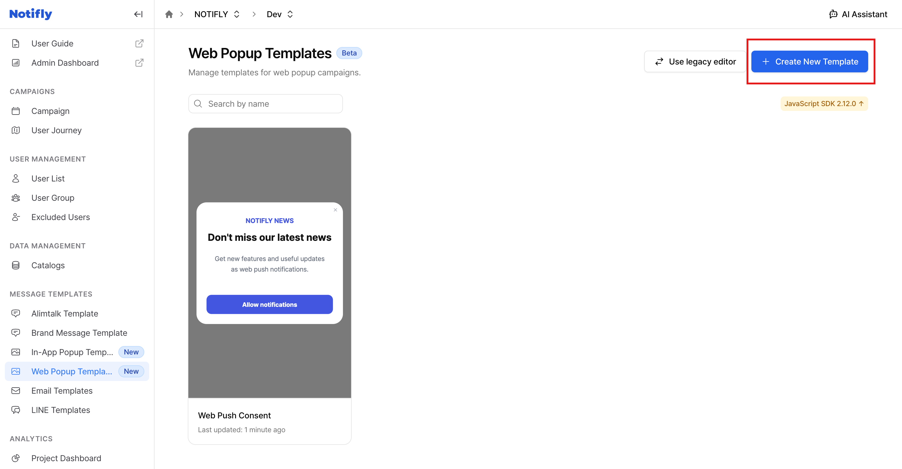
Editor layout
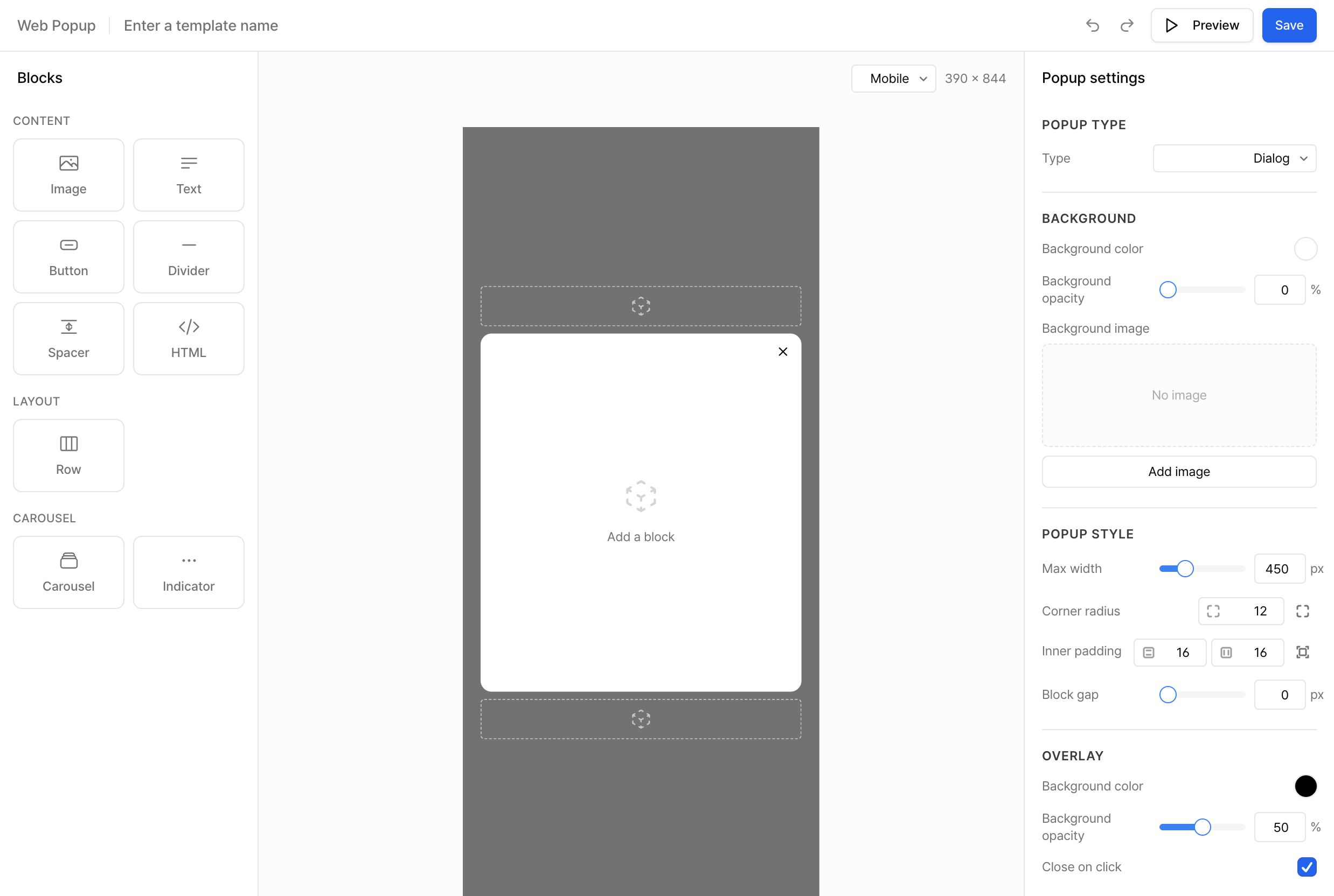
Add a block
Select a block in the left panel to add it to the canvas. Click it on the canvas to show its blue outline and toolbar.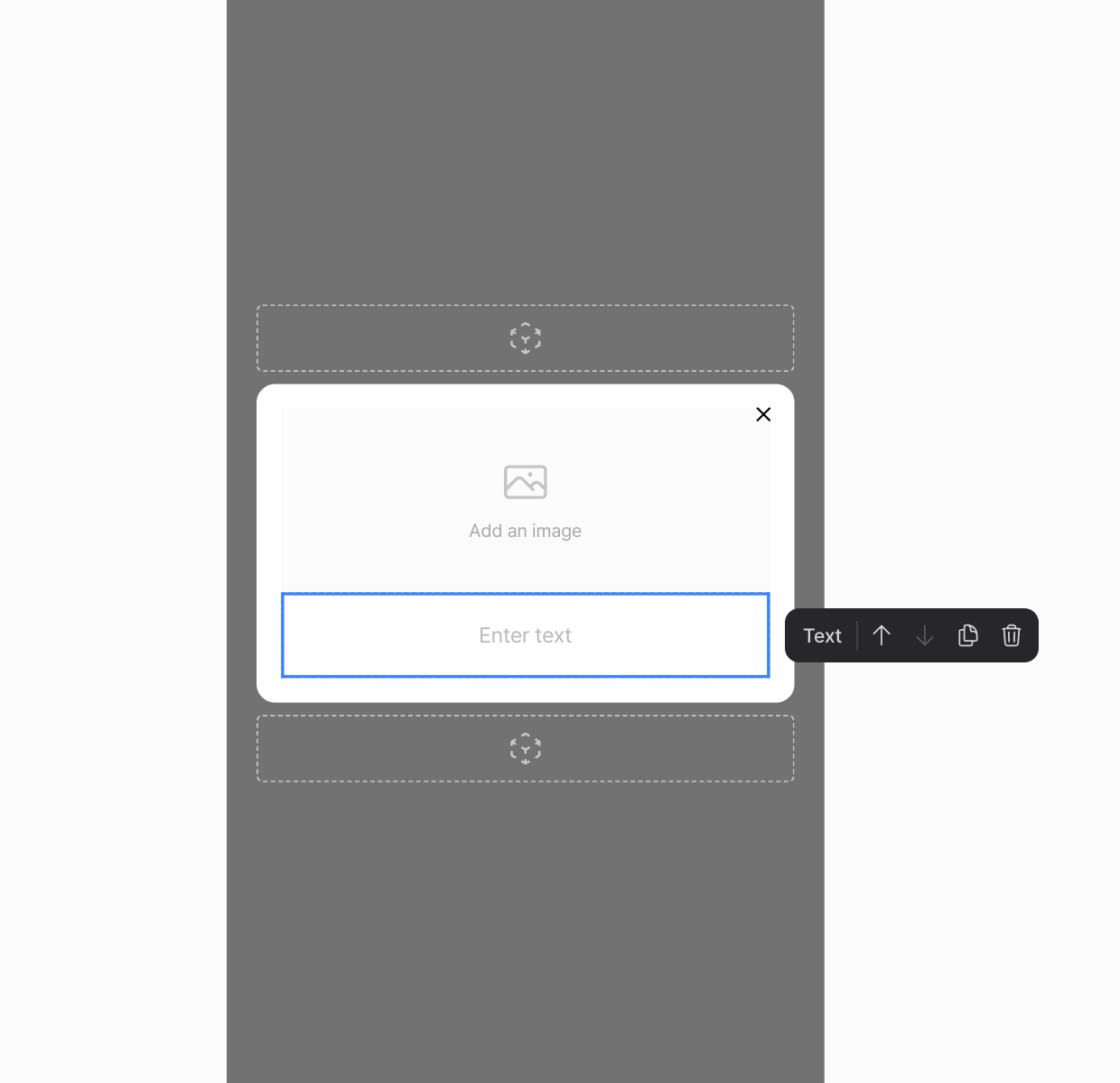
- Use Move up or Move down to reorder the block.
- Use Duplicate block to make a copy with the same settings.
- Use Delete block to remove it.
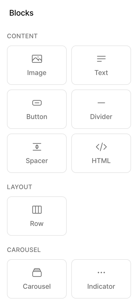
Content blocks
Add an Image block, then upload the image in the right panel. Set the width as a percentage. For height, choose automatic sizing or set an aspect ratio. You can also set the corner radius, margin, click action, and alternative text. Image URLs and click actions in Image blocks don’t accept personalization variables. Enter the text for a Text block in the right panel. Set the font, size, line height, weight, color, and alignment for the block. To format part of the text, select it and use the bold, italic, underline, or color controls. To insert a user’s name or event data, add a personalization variable.- Select the Text block and place the cursor in Text content where you want to insert the variable.
- Click Personalization Variable below the field.
- Set the Variable Type and Variable Name. Under Default Value (Optional), enter what to show when the variable has no value.
- Click Paste to insert the Liquid expression at the cursor.
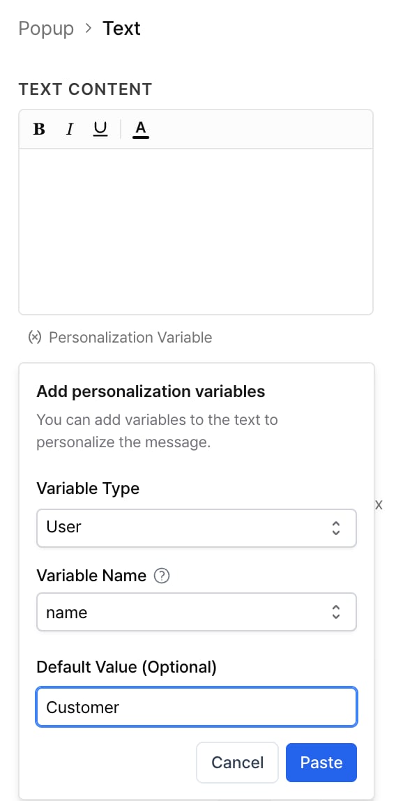
name as the variable name. Enter there as the default value to show “Hi there!” if the user’s name is missing. The screenshot uses the Korean fallback 고객 (customer).
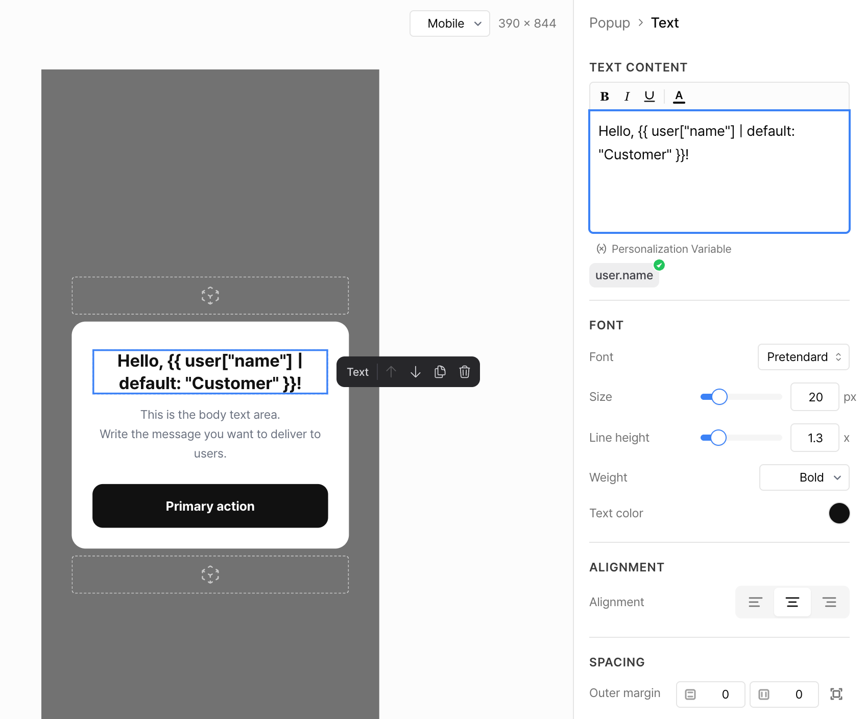
notiflyPopup methods to close the popup, open a link, or control a carousel.
Click Personalization Variable in the HTML field to insert a variable. Enter Liquid directly to write conditions or loops, read from a catalog, or use Connected Content or abort_message. When abort_message runs, the popup doesn’t appear.
Call notiflyPopup methods
Call methods from the onclick attribute of an HTML element, as shown below.
Collect web push consent
A web popup button can save the user’s consent and ask the browser to allow notifications in one click. The popup closes before the user responds to the browser prompt. Visitors can use the button without signing in. You need JavaScript SDK 2.22.0 or later and web push setup on your site. On unsupported SDK versions, the consent button is disabled.- In the web popup editor, select the Button block that you want to use to collect consent.
-
Under Click action in the right panel, select Web push consent. This action is available only on web popup buttons.
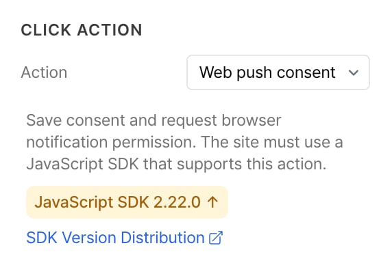
- In the button label and the popup text, explain what notifications the user will receive. Save the template and select it in a campaign.
- Run the campaign for test users only. Use a browser where notification permission is still undecided for your site. Trigger the popup and click the consent button. Check the test user’s saved consent and verify that the browser receives the permission request. Preview only logs the click action.
To request permission only through the web popup, turn off Auto Display in Settings > SDK Settings > Website Settings > Permission Prompt Settings. For integration requirements, see the JavaScript SDK guide.
The consent timestamp comes from the browser where the user clicked the button. If the user gives consent again in a newly displayed popup, Notifly updates the timestamp to the new click time. Users who have never consented may have neither value.
These are reserved Notifly properties. You can’t create or delete them, or mark them for encryption, in general user property settings. View the saved values in the user’s details.
What happens when the user clicks
Notifly sends the permission request straight to the browser without showing its default permission prompt, then closes the web popup.
To let users withdraw consent, add a setting on your site or in your service that updates the consent property. Exclude users who withdraw consent from the campaign audience. See Manage consent and browser permission.
Identify which button a user clicked
In the Button block settings, enter a name in the field markedbutton_name. Notifly includes the name in the click event. Give each button a different name if you want to track clicks separately.
Layout blocks
A Row block puts two to four columns side by side. Set the width of each column as a proportion of the row, then set vertical alignment and block spacing. You can also set the background color, opacity, and outer margin. Add blocks such as Image, Text, or Button to each column.Carousel blocks
Add a Carousel to display slides. Each popup can contain one carousel. Select the carousel to open its settings in the right panel.- Slide management. Add a slide or select an existing one to reorder, duplicate, or delete it.
- Slide transition. Choose an animation (Slide, Fade, or None) and decide whether to allow swiping or looping.
- Autoplay. Turn on automatic slide transitions and set the time between slides.
- Indicator. Choose dots or a slide number. Set the position, offsets, size, and spacing. For dots, set the colors of the active and inactive dots. For a slide number, set the text and background colors.
Popup settings
Click an empty part of the canvas or click Popup at the top of the right panel to edit the settings for the entire popup.Popup type
- Dialog appears in the center of the screen. This is the default.
- Bottom Sheet slides up from the bottom of the screen.
- Full Screen fills the screen.
Background
Set the background color, opacity, or image of the popup content area.Popup style
Set the padding and block spacing. If the popup type supports it, set the maximum width and corner radius in pixels. Switch to individual inputs to set a different radius for each corner or different padding for each side.Overlay
For a dialog or bottom sheet, set the overlay color and opacity. Turn on Close on click to close the popup when the user clicks the overlay.Animation
Set Enter animation and Exit animation separately. For each, choose None, Fade, Slide Up, Slide Down, Slide Left, or Slide Right.Close button
Choose whether to show the close (X) button. Set the corner (top left or top right), placement (inside or outside the popup), size in pixels, stroke weight, icon color, and horizontal and vertical offsets.Save and use the template
Click Save in the toolbar. To use a template from Web Popup Templates, select it when you set up a campaign or user journey. When you save a template containing personalization variables, Notifly enables personalization automatically. When the popup appears, Notifly fills in the variables with user or event data.Preview shows the Liquid expression before Notifly fills in the actual values. To test what users will see, run a campaign for test users only. Trigger the configured event on a website that uses a supported SDK version.
FAQ
Does changing the popup type reset my settings?
Does changing the popup type reset my settings?
Blocks and their content stay in place. Some style settings may reset, depending on the new type. Choose a type before editing the individual styles.
How many slides can I add to a carousel?
How many slides can I add to a carousel?
There is no slide limit. Use about three to five slides so users can browse them easily.
Can I add a font?
Can I add a font?
At the bottom of the font list, click Add font. In Google Fonts, select a font and click Get font, then Get embed code. Copy the URL that starts with
https://fonts.googleapis.com/ and paste it into Webfont URL. In Font name, enter the exact name shown in Google Fonts. Click Load font, then Add.